One very important aspect of certain types of photography whether you're colorblind or not is correct color reproduction. There is a lot that can go in to understanding and properly white balancing but the reality is that today there are many simpler approaches to ensuring correct color that eliminate much of the guesswork or the need for a deep technical understanding of the issue! You don't need to white balance with a piece of white paper, or anything white at all. You do need to make sure you white balance off of something that is neutral and reasonably well lit but not blown out from the camera's point of view. There are plenty of products out there trying to muscle each other out of the way but which ones are useful' This article won't review each of them but will hopefully give the reader, in particular the colorblind reader, some perspective to help them choose the right tools for the job.
The reality is that the majority of the tools on the market work, but some work better than others and will work better for different situations. There are reviews out there from people with the eyes to judge whether the products are doing the job so rather than go down that road I'll just suggest you follow some of these links if you want to learn more in detail about these products. Below are a couple of articles I've found and read that compare a variety of products that are on the market. They're both by the same author, but there are numerous reviews of specific devices all over the web and if you have any questions about any of them don't hesitate to contact me! I have not tested the products in the two links below so I cannot vouch for their complete accuracy but they still provide a good sense of the realities of white balancing.
An Investment in White Balance that Appreciates Right Now
Product Comparison: Reflective White Balance Devices
White what?
White balancing is the process of setting the white reference for the camera, calibrating it to the color of the light source. In other words your camera has no idea what white is without taking a reading off of something in the scene. If you use automatic white balancing in your camera it is looking for the bright objects in the scene and assuming they're supposed to be white and that their appearance is dependent solely on the color of the light source. It then adjusts the balancing of the colors in the image to ensure those brightest areas become white.
Cameras can be easily fooled when the brightest object in the scene is not actually supposed to be white, however the majority of scenes are such that auto white balancing (AWB) usually gets pretty close, even if not perfect. White balance presets can improve performance under certain lighting like tungsten or fluorescent which can challenge the AWB computations. The best way (other than using a color temperature meter) to determine the correct color temperature for the light source in your scene is to take a test shot of a neutral reference and use that to manually set the white balance in camera. Many people do this with a piece of white copy paper although this isn't always a reliable white target since optical brighteners among other variations in the color of paper can mean they aren't always a true white. There are plenty of other creative solutions, even putting translucent tupperware over the lens to take a custom white balance reference shot.
Identifying wrong colors
Proper white balancing is important if you want to ensure that your photograph accurately represents the color of the subject. For many people with bad color vision it can be very difficult to know when something is right or wrong. It's usually not good when a person's skin tone is wrong, or you misrepresent the color of a product in your photography... especially if someone is paying you for the result! People with normal color vision may be able to rely on their eyes and a calibrated screen and adjust color by appearance alone, although many will still use a reference target to eliminate guesswork. Sometimes you don't want a 'neutral' color balance and you might choose to warm up the colors a bit which is often pleasing on skin tones. Some of the white balance products, like the baLens, come with a second insert which will provide a warmer color balance. Otherwise knowing where neutral is can give the colorblind photographer a starting point for tweaking the colors.
One of the commonly held beliefs is that all colorblind people will impart a particular color emphasis on their photos when they process them. In other words a deuteranomalous person might be guilty of making their photos a touch too green (as sometimes I have). The problem is that while this can be true, it's not always by the same amount and not all colorblind people will be able to discriminate the subtle differences that make detecting any other color issues possible. I am deuteranomalous but I also have poor color discrimination of all colors, so a small cyan or yellow shift might not be noticeable by me and if I did know something was wrong I'd be challenged to figure out what or by how much. Traditionally the only way I have been able to ensure my colors are both accurate and realistic is to have someone with normal color vision view the results on my calibrated display (one reason I keep my display calibrated, among others) or their calibrated display. You don't even have to be colorblind in the traditional sense to have trouble with color correction, just having poor color discrimination can cause all kinds of trouble.
When possible I can correct photos based on assumptions about what color certain objects in the scene should be. This works best with gray objects like concrete, however as concrete ages and discolors this can prove to be a tricky and unreliable method. Having an understanding of what color something should be and working with the RGB values can help to correct some issues but is obviously by no means a universally applicable solution. So what alternatives are there?
White balancing products
In the attempt to not only improve the color in your photographs, many companies have offered a variety of products which can be useful in white balancing. The majority of white balancing products fall under two categories: devices you put on your lens and reference materials you place in your scene.
Lens-based devices like the ExpoDisc or baLens require that you mount them like a lens cap or filter and take a photo with your camera pointed at the light source. These products contain various diffusing materials which are supposed to be spectrally neutral and allow you to use the resulting image to set a custom white balance. I have had the opportunity to experiment a bit with each of these and the ExpoDisc seems to be a somewhat more reliable product. The baLens proved to be troublesome when the manufacturer was demonstrating it at the PDN PhotoPlus expo last fall. These products will blend mixed lighting together as well depending on how you use them. If you want to ensure that a certain object in your scene is correctly color balanced you need to be careful when using these to make sure you white balance to whatever dominant source is illuminating that object by pointing the camera at that source with the device fitted.
One problem I have with these products is that you need to either have one to fit every lens you might use it on or you need adapter rings to allow them to fit. More significantly, I personally prefer reference cards which you include in your scene or in a test shot. With these products you then use the white-balance eyedropper tool in your RAW conversion program (you better be shooting RAW!) to sample the reference card and set the white balance. This method can have drawbacks as well; unless the reference is in the right area and the reference is relatively devoid of serious noise issues, you can have problems with the RAW conversion utility misjudging the color temperature. A noisy image will introduce errors due to variations in pixel value which is why it's best that the RAW conversion program doesn't sample a single pixel but instead averages over an area. Placing the reference correctly is important as well, you need to position it where it will be illuminated by the source you want to white-balance to. If you are shooting in mixed lighting this can be a bit tricky since the card in one position may let you white balance to one source but if the card is moved to another position you may be correcting for a completely different source. Some of these reference cards come big enough that you can also use them as you would a sheet of white paper and just take a frame-filling image of it to set the white balance manually in camera.
As the links above show, the various products each have their strengths and weaknesses and it's best that you consider how you shoot and want to include the device.
A few options
The products below include different types of test targets and lens cap/filter like devices:
Lens cap/filter type devices:
- Expo Imaging ExpoCap and ExpoDisc
- baLens cap
- CBL Color Balance Lens
Reflective reference devices:
- Digital Image Flow Digital Grey Kard
- WhiBal reference gray cards (I have a few of these)
- X-Rite ColorChecker, the current form of the classic MacBeth ColorChecker and some other new variants
- Datacolor SpyderCUBE, an interesting new tool which I am considering trying
To read more about the SpyderCUBE there's a good introductory article to this device and all it can do here.


 Although it has been a while since the last post like this I am always interested to find more tools meant to help the colorblind with using their computers or photography in general. I had heard of this program before but didn't have the time to try it out and post about it until now.
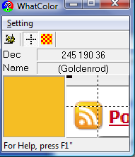
WhatColor is a shareware program, the program you download is a fully functional evaluation copy and an $8 registration is requested if you like and intend to continue using the software. It's much cheaper than the eyePilot software I reviewed previously but is also much simpler however that doesn't mean it isn't useful. For one thing it is compatible with Windows Vista so if you're in that situation and eyePilot still doesn't work (they have yet to release a Vista version, so I suspect they'll be late to the Windows 7 game as well) then this is a good tool to check out. Unfortunately WhatColor does not offer a Mac compatible version.